 Peterborough United
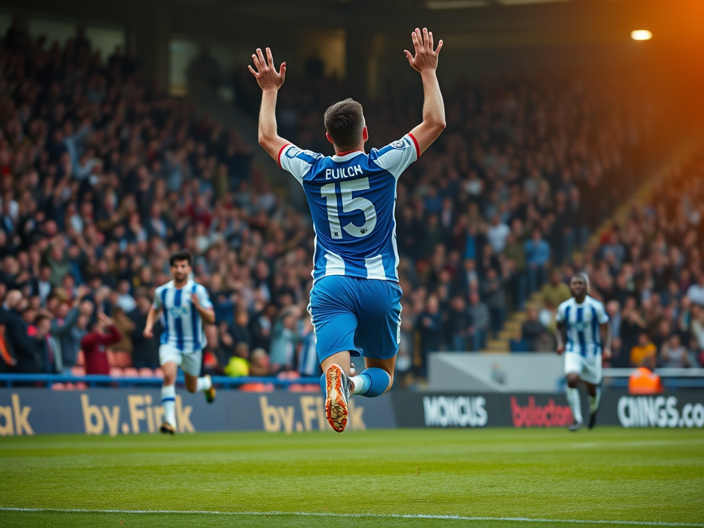
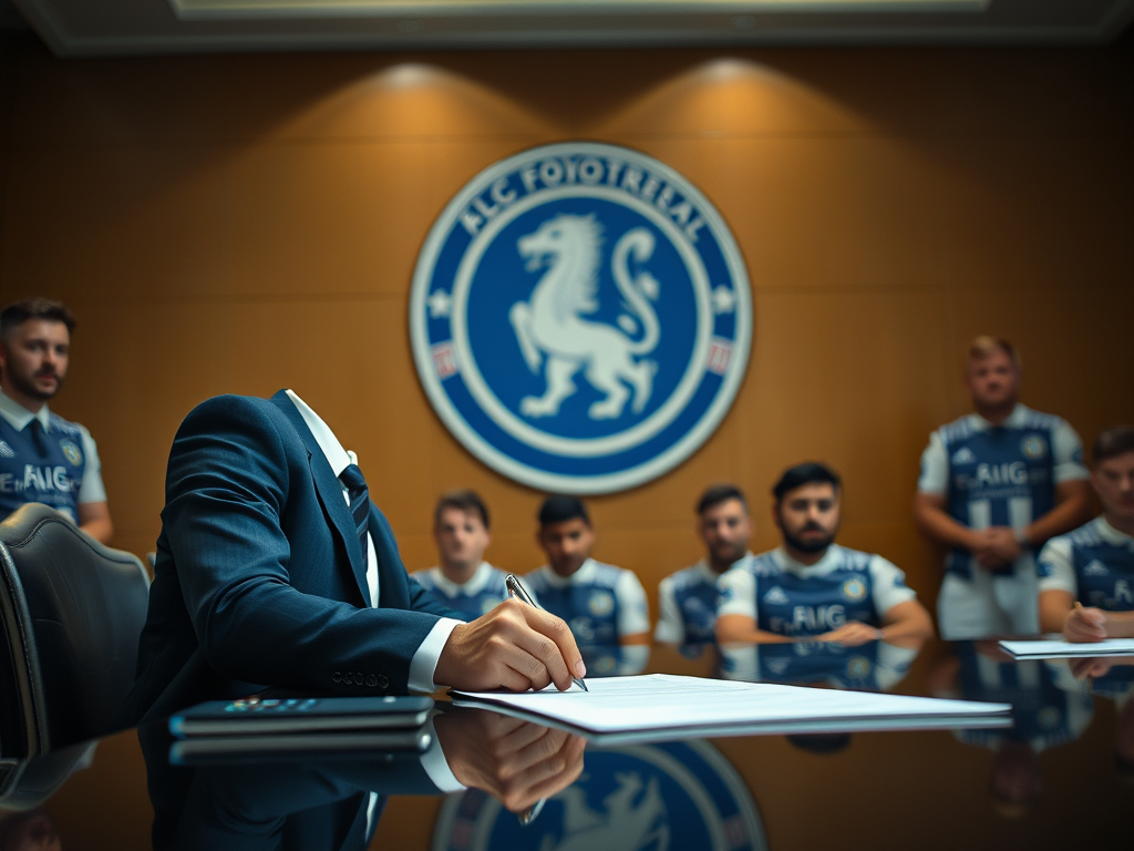
Peterborough United has recently launched a new club logo, marking the first rebranding in 18 years. The club's decision to modernize its identity comes after feedback from fans and aims to align with contemporary platforms like social media. The new emblem, which replaces the city's coat of arms that has been a staple since the 1970s, features a streamlined design with a winged lion holding a key, paying homage to Peterborough's heritage. Fans have had varied reactions to this change. Some, like Bill Thatcher from Eastfield, appreciate the new design for its simplicity and the inclusion of the key, a significant symbol in the city. However, others, such as Michelle Wilson, feel the new logo lacks a connection to Peterborough and does not resonate with their identity as fans. The chairman of Posh, Darragh MacAnthony, emphasized that branding is crucial for the club's evolution and securing commercial opportunities. The new crest was designed by Christopher Payne, who engaged with local historians and fans during the creative process. As Peterborough United moves forward with its new identity, the reactions from supporters highlight the balance between tradition and modernity in football branding.
Club
Peterborough United Fans React to New Club Logo Launch
Peterborough United has unveiled a new logo after 18 years. Fans share mixed reactions to the club's rebranding and its significance.